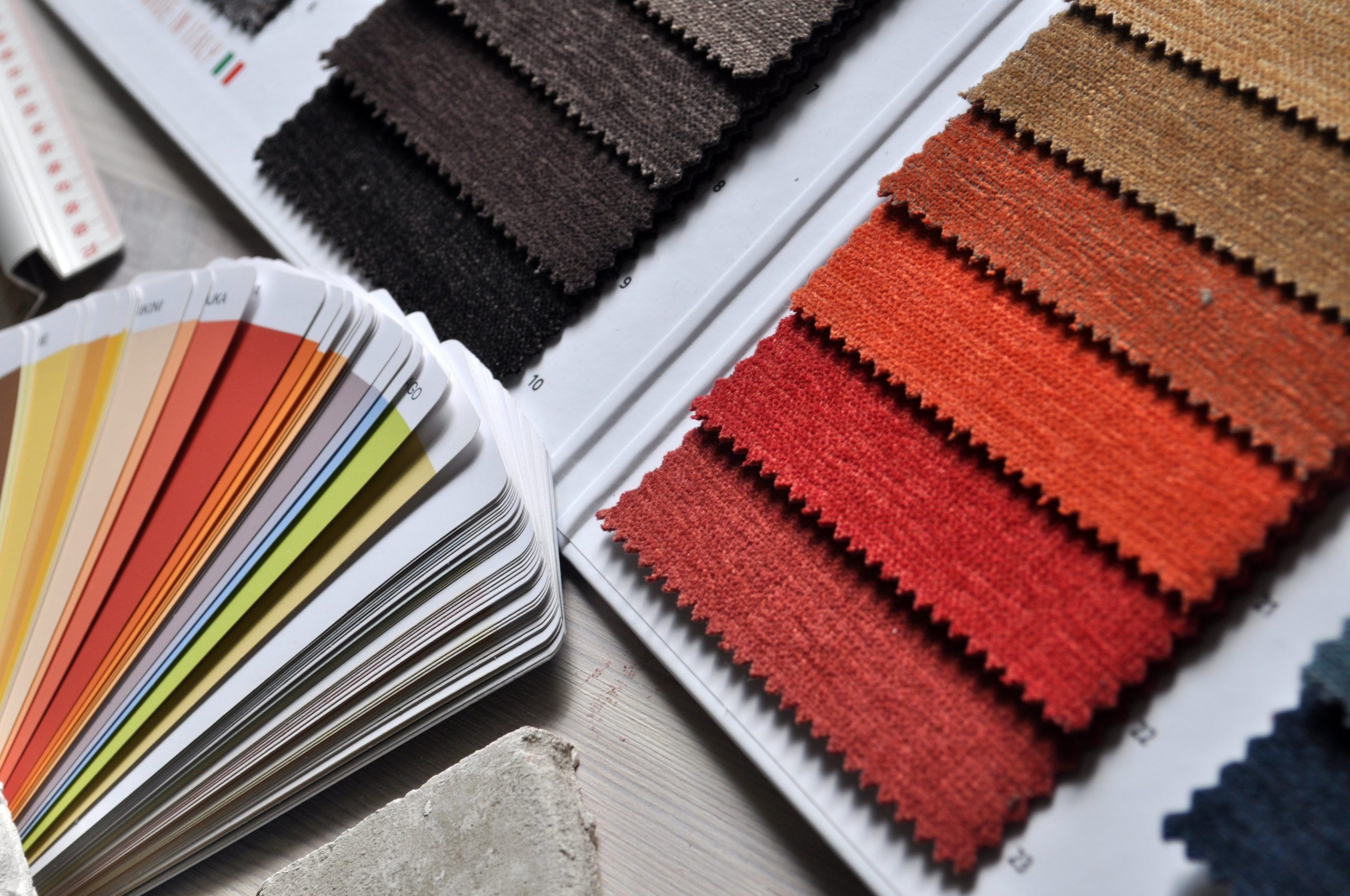
When it comes to choosing colours for an interior space, whether it is changing the upholstery on a sofa or renovating a bedroom, the most typical question I get as an interior architect is: “How do you know it will look nice?”
I realise from people’s reaction that the doubt is genuinely there together with the difficulty to pick a hue of green among hundreds of them. Thankfully, nature has our back once again and all we need is some time to observe.
Majesty of Mother Nature
For me, there is no bigger master than nature and her endless colours and textures, all combined in the most elegant and harmonious way.
Most of the pictures on my cell phone are from plants, rocks, fallen leaves, natural patterns, sky views and sunsets and, more than often, I scroll through these pictures to get inspired. After all, everything we see with our eyes stays imprinted in our memory, evoking sensations and feelings even years later.
It is partially because of these memories that we feel nice inside a place or not: for example, why we feel relaxed sitting in a living room, or energised to cook in a kitchen.
To give you a simple example, we often use expressions like ‘sand’s beige’, ‘forest green’ or ‘stone grey’ and immediately we all know the exact meaning of these words.
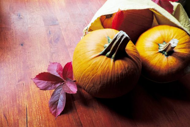
And not only can we recall the exact colour, but we recollect from our memory an entire ambience and this inspires us even further to make more nice choices, like matching an ‘autumn red’ with a ‘pumpkin orange’.
Process of the palette
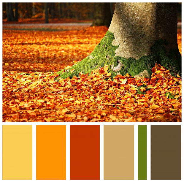
In the colour palette I have prepared for you, I am trying to illustrate this process.
Of course, many variations can occur when it comes to an interior space: variations that have to do with the natural light, the existing basic materials (like the floor, cabinets, tiles, how spacious or restrained the room is) and most of all, the people living there – the essence of their personality.
You see, we can take the exact ‘autumn’ palette and apply it to a large living room of a country house, to an office room in a city apartment, and to decorative objects in a kitchen and dining area.
And in doing so, we can make the palette more vibrant, more pastel or more minimal. We can change the proportions, choose a dominant colour, minimise the usage of another, add extra hues of another one, and so on.
Remember to remember!
The bottom line of this adventurous process is that we can never go wrong, as long as we take time to observe the balance of the colours we choose, the harmony of their combination, the primary feeling they provoke in us (for example, calmness, energy, warmth) and, most of all, whether we feel alive inside and eager to live in the space we design.
It’s exactly like the way we process a walk in the nearby park or forest. Each and every one of us goes into the park or forest overthinking, distracted, in a hurry and feeling disconnected. But, each and every one of us leaves the park or a forest more centred, balanced, alive and joyous.
This autumn, I invite you to observe nature more and, in case you are in the middle of a project that requires some colours and material definition, to just relax. Sit back, take a breath and visualise your perfect memory of nature.
Is it a walk on the beach, a city park after rain, a cloudy sky or a calm lake? My heart is pumping with all the beauty that lies in there and the endless possibilities of beautiful colour palettes. I am sure you will see them too.


