If you’ve ever wondered about the extent of pollution at your address, speculate no further.
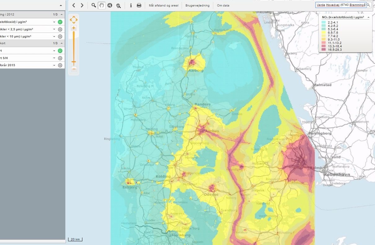
The Danish Centre for Environment and Energy (DCE) has released a new interactive map that shows the air quality across Denmark as part of its new ‘Air on your street’ project.
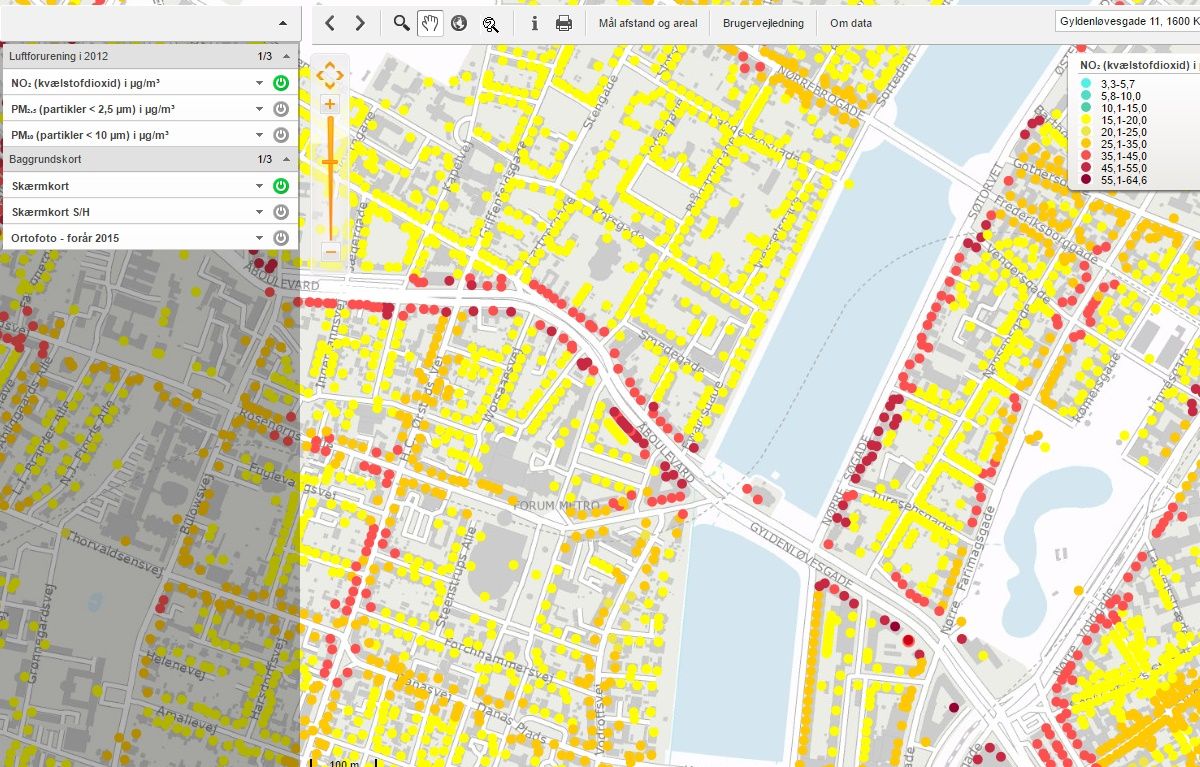
The map (here in Danish) allows the user to gain an insight into the nitrogen dioxide (NO2) and particulate matter levels where they work and live – all the way down to streets and even individual addresses.
“The goal with the map is to illustrate the geographic variation in air quality across Denmark by showing the average amounts for the individual substances,” said Steen Solvang Jensen, a senior researcher with DCE.
“It’s the calculated mean concentrations of the individual substances over the course of a year.”
READ MORE: Air quality in Copenhagen slammed in letter from EU
Cleaner now
Users can type in their addresses to see what the air pollution levels are: ranging from 3.3-5.7 NO₂ per µg/m³ (micrograms (one-millionth of a gram) per cubic meter air) to 55.1-64.6.
The map showed that air pollution levels were high along main city arteries such as Åboulevard and Lyngbyvej in Copenhagen.
DCE said that the air quality levels were taken during 2012 and the air has become cleaner across Denmark since that time.